


Defensoria Pública do ParanáDefensoria Pública do Paraná
Online user self-registration websiteSite de autocadastro de usuários online
The Defensoria Pública is Brazil's public institution offering free legal assistance to low-income people across a wide range of legal matters. This project redesigned its online registration system that gives users the option to complete their first service contact digitally instead of in person.A Defensoria Pública é a instituição pública brasileira que oferece assistência jurídica gratuita a pessoas de baixa renda em uma ampla gama de questões legais. Este projeto redesenhou seu sistema de cadastro online, que dá aos usuários a opção de realizar o primeiro contato de atendimento digitalmente, em vez de presencialmente.
- web designweb design
- responsive designdesign responsivo
- UX/UI designUX/UI design
- UI designUI design
- redesignredesign
- 20252025
- 20262026
Made at Lactec Research InstituteDesenvolvido no Instituto de Pesquisas Lactec
What is Defensoria PúblicaO que é a Defensoria Pública
The Defensoria Pública (Public Defender’s Office) is a public institution in Brazil that provides free legal assistance to people who cannot afford a private lawyer. Unlike the U.S. concept of a “public defender,” which is typically limited to criminal cases, Brazil’s Defensoria Pública covers a much broader range of legal matters, including family law, consumer rights, housing, health, and civil disputes, in addition to criminal defense. Each Brazilian state has its own Defensoria Pública; the one referenced here is the Defensoria Pública do Estado do Paraná (DPE-PR).A Defensoria Pública é uma instituição pública no Brasil que oferece assistência jurídica gratuita a pessoas que não podem pagar um advogado particular. Diferente do conceito americano de “public defender”, geralmente limitado a casos criminais, a Defensoria Pública brasileira abrange uma gama muito mais ampla de questões jurídicas, incluindo direito de família, direitos do consumidor, moradia, saúde e disputas cíveis, além da defesa criminal. Cada estado brasileiro tem sua própria Defensoria Pública; a referenciada aqui é a Defensoria Pública do Estado do Paraná (DPE-PR).
Who are the main usersQuem são os principais usuários
The institution serves people in situations of social vulnerability, specifically those with a family income of up to three minimum wages. Many of these users face real barriers to accessing services in person, including the cost of transportation, limited availability during work hours, and, in some cases, limited familiarity with digital tools or lack of internet access altogether. The service is designed to reach a population that often cannot easily travel to a physical office or navigate bureaucratic processes on their own.A instituição atende pessoas em situação de vulnerabilidade social, especificamente aquelas com renda familiar de até três salários mínimos. Muitos desses usuários enfrentam barreiras reais para acessar os serviços presencialmente, incluindo o custo do transporte, disponibilidade limitada durante o horário de trabalho e, em alguns casos, pouca familiaridade com ferramentas digitais ou falta de acesso à internet. O serviço foi projetado para alcançar uma população que muitas vezes não consegue se deslocar facilmente até um escritório físico ou navegar por processos burocráticos sozinha.
The ChallengeO Desafio
The client’s self-registration platform was built on outdated technologies, creating performance and maintainability issues that made a full redesign necessary. The core constraint was data integrity: since the registration database was already being used, no fields could be added or removed. Any structural change risked destandardizing the data of existing registered users, requiring the redesign to work strictly within the boundaries of the current data architecture.A plataforma de autocadastro do cliente foi construída sobre tecnologias desatualizadas, criando problemas de performance e manutenibilidade que tornaram necessário um redesign completo. A restrição principal era a integridade dos dados: como o banco de dados de cadastro já estava em uso, nenhum campo poderia ser adicionado ou removido. Qualquer mudança estrutural arriscava despadronizar os dados dos usuários já cadastrados, exigindo que o redesign funcionasse estritamente dentro dos limites da arquitetura de dados existente.
The StrategyA Estratégia
After analysing the existing system and mapping its constraints, the primary approach was to reorganize the input fields into a more intuitive sequence that aligns with how users naturally provide information, reducing cognitive load throughout the registration flow.Depois de analisar o sistema existente e mapear suas restrições, a abordagem principal foi reorganizar os campos de entrada em uma sequência mais intuitiva, alinhada à forma como os usuários naturalmente fornecem informações, reduzindo a carga cognitiva ao longo do fluxo de cadastro.
Beyond structure, several UX principles guided the redesign: visibility of system status, giving users a clear sense of progress and reducing uncertainty. Error handling was also reworked, with more precise and actionable feedback signifiers replacing vague or unhelpful messages. Finally, all copy and microcopy were rewritten from the ground up, adopting a tone of voice that is warmer, more empathetic, and oriented toward guiding the user.Além da estrutura, vários princípios de UX guiaram o redesign: visibilidade do status do sistema, dando aos usuários uma noção clara de progresso e reduzindo incertezas. O tratamento de erros também foi refeito, com sinalizadores de feedback mais precisos e acionáveis substituindo mensagens vagas ou pouco úteis. Por fim, todo o copy e microcopy foram reescritos do zero, adotando um tom de voz mais caloroso, empático e voltado para orientar o usuário.
ProcessProcesso
Evaluated the existing interface based on Nielsen's Usability Heuristics to establish a baseline for improvement.Avaliação da interface existente com base nas Heurísticas de Usabilidade de Nielsen para estabelecer uma linha de base para melhorias.
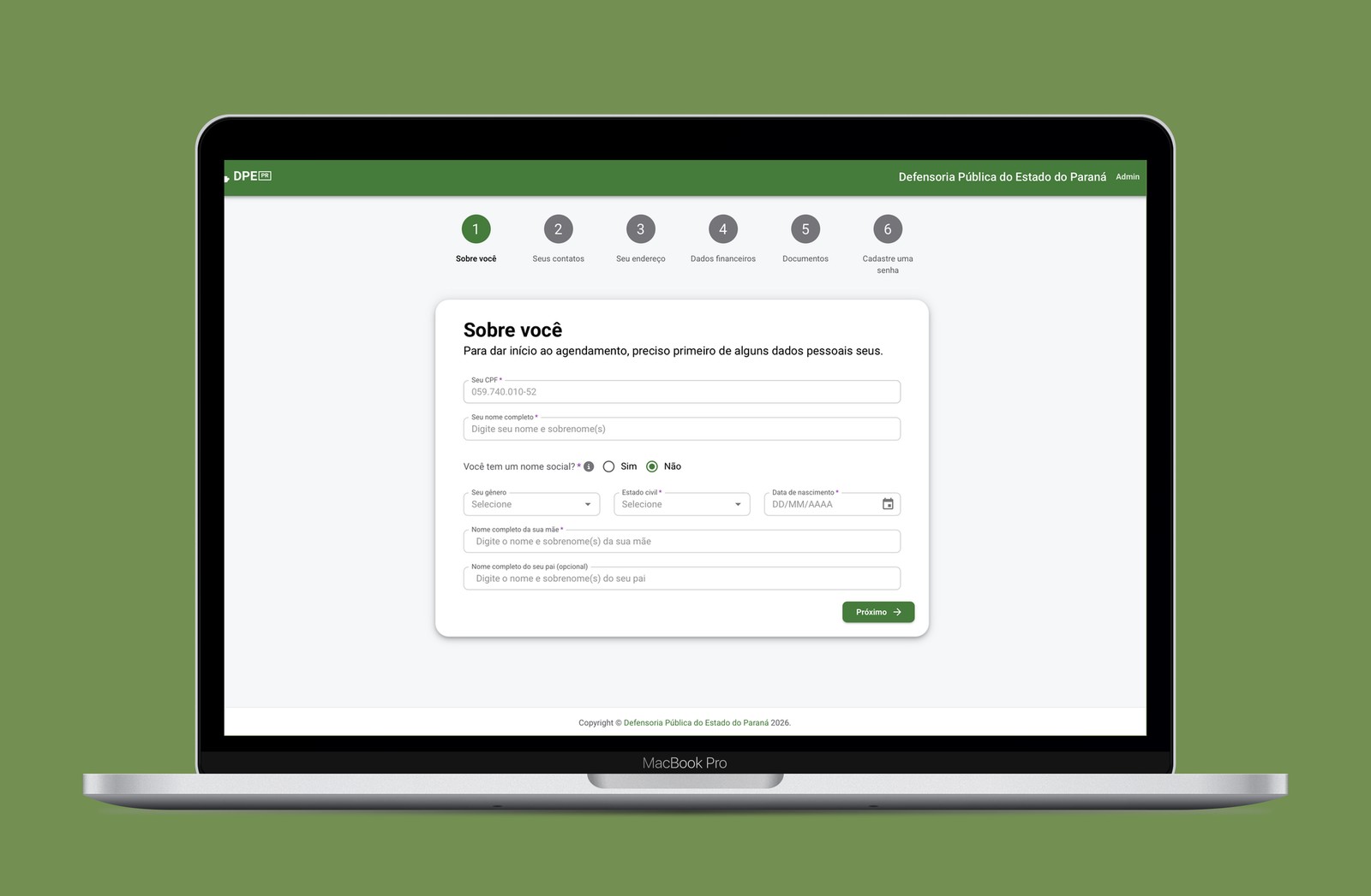
Reorganized and recategorized all input fields into logical groupings that better reflect the user's mental model.Reorganização e recategorização de todos os campos de entrada em agrupamentos lógicos que refletem melhor o modelo mental do usuário.
Rewrote all interface text, from field labels to error messages, adopting a tone that is empathetic and direct.Reescrita de todo o texto da interface, de rótulos de campos a mensagens de erro, adotando um tom empático e direto.
Designed new UI components to support the updated experience, including a step indicator to guide users through the registration flow.Design de novos componentes de UI para apoiar a experiência atualizada, incluindo um indicador de etapas para guiar os usuários pelo fluxo de cadastro.
Developed a detailed, interactive prototype to validate the redesign before development.Desenvolvimento de um protótipo detalhado e interativo para validar o redesign antes da implementação.
Prepared and delivered design specifications, ensuring a smooth and accurate transition to the development team.Preparação e entrega das especificações de design, garantindo uma transição precisa e tranquila para a equipe de desenvolvimento.
Before and AfterAntes e Depois
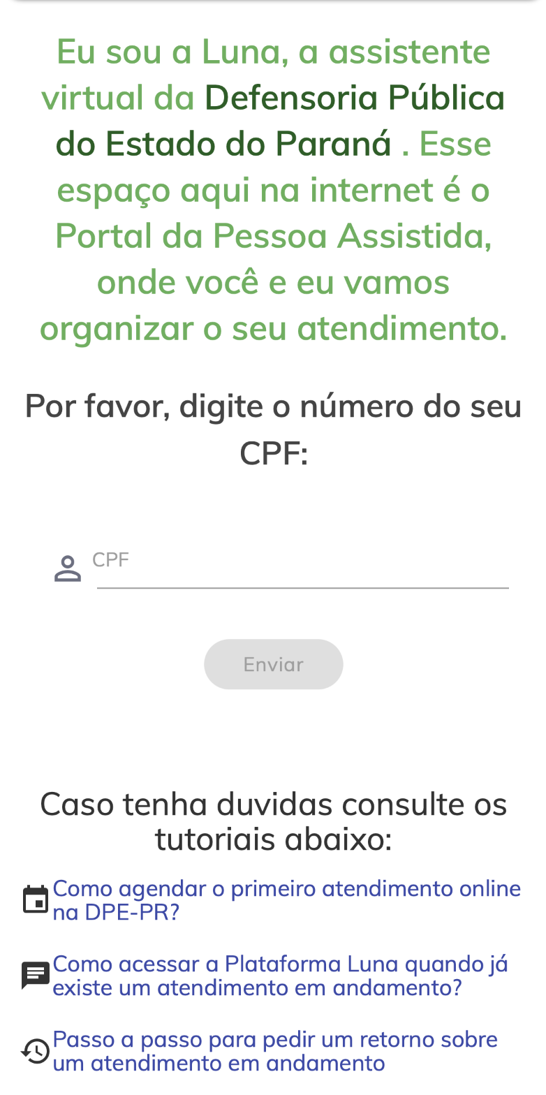
Desktop-first layoutLayout desktop-first

Mobile compatibility and responsiveness as a top priorityCompatibilidade com dispositivos móveis e responsividade como prioridade máxima
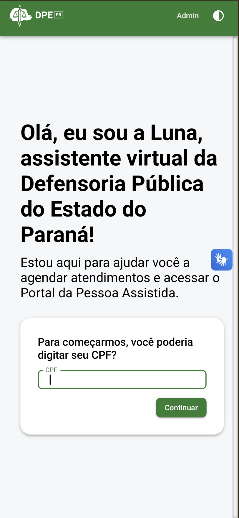
UX insight based on data: in Brazil, 65% of the population accesses the internet only via smartphones, and in economic classes D and E (lower income brackets), this percentage is even higher, at 87%. Since the Public Defender’s Office serves people in social vulnerability, making the website optimized for the best possible mobile experience was identified as a top priority.Insight de UX baseado em dados: no Brasil, 65% da população acessa a internet apenas por smartphones, e nas classes econômicas D e E (faixas de renda mais baixa), esse percentual é ainda maior, chegando a 87%. Como a Defensoria Pública atende pessoas em vulnerabilidade social, otimizar o site para a melhor experiência mobile possível foi identificado como prioridade máxima.
Fonte dos dados: TIC Domicílios 2025
Input fields with no categorization or groupingCampos de entrada sem categorização ou agrupamento
Clearly labeled sections organizing fields into logical, named stepsSeções claramente rotuladas organizando os campos em etapas nomeadas e lógicas
No indication of system statusNenhuma indicação do status do sistema
Step indicator providing users with a clear sense of progress and completionIndicador de etapas dando aos usuários uma noção clara de progresso e conclusão
Unhelpful text and redundant instructionsTextos pouco úteis e instruções redundantes
Fully rewritten copy with an empathetic tone: helpful and direct, without being patronizingCopy totalmente reescrito com tom empático: útil e direto, sem ser condescendente
Confusing and unhelpful alert messagesMensagens de alerta confusas e pouco úteis
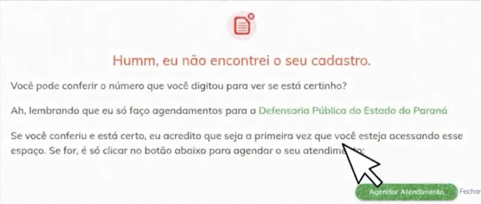
After entering your national ID number (CPF), if the system doesn’t recognize it, it displays a message styled like an error, saying “I couldn’t find your registration.” The message then asks you to double-check the number you entered, and only at the end does it acknowledge that you might be a new user.Ao digitar o CPF, se o sistema não o reconhece, ele exibe uma mensagem no estilo de erro, dizendo “Não conseguimos encontrar seu cadastro.” A mensagem então pede para você conferir o número digitado, e só no final reconhece que você pode ser um novo usuário.
UX insight: The system induces anxiety in users who simply wanted to register, making them feel like they’ve done something wrong when no error actually occurred.Insight de UX: O sistema induz ansiedade em usuários que simplesmente queriam se cadastrar, fazendo com que sintam que fizeram algo errado quando, na verdade, nenhum erro ocorreu.
Redesigned flow that minimizes unnecessary friction and delivers clear, actionable messagesFluxo redesenhado que minimiza atritos desnecessários e entrega mensagens claras e acionáveis
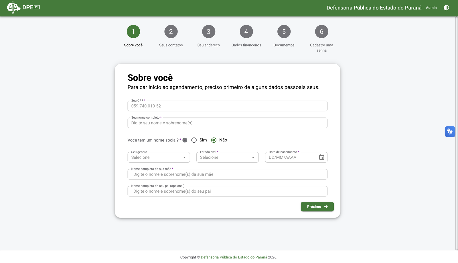
UX improvement: Now, if the system identifies that you have an account, it will ask for your password. If not, it will redirect you to the registration form.Melhoria de UX: Agora, se o sistema identifica que você já tem uma conta, ele pedirá sua senha. Caso contrário, você será redirecionado para o formulário de cadastro.

ResultsResultados
The redesigned registration system was approved by the client and successfully launched, replacing the legacy platform for end users.O sistema de cadastro redesenhado foi aprovado pelo cliente e lançado com sucesso, substituindo a plataforma legada para os usuários finais.
The solution is currently live and has been well-received, with plans underway to expand its rollout further, indicating stakeholder satisfaction and confidence in both the design and its scalability.A solução está atualmente em produção e tem sido bem recebida, com planos em andamento para ampliar ainda mais sua implementação, indicando a satisfação das partes interessadas e a confiança tanto no design quanto em sua escalabilidade.